CSS(Cascading Style Sheet)
层叠样式表,通过样式表对网页进行装饰
样式表的组成
样式表由
规则组成规则由
选择器 + 声明块组成声明块由
声明组成声明由
属性名 + 属性值组成
浏览器读取编译 css 选择器的顺序 从右向左
- 匹配效率更高
包含块
就是之前理解的父元素的新解释
- 对于浮动元素, 其包含块定义为
最近的父元素 - 对于定位元素
- absolute 定位的子元素, 其包含块是
其最近的有定位的祖先元素 - 如果没有定位的祖先元素, 则其包含块定义为
初始包含块
- absolute 定位的子元素, 其包含块是
- 绝对定位参照于 包含块 定位
- 固定定位参照于 视口
初始包含块
是一个视口大小的矩形
- 只有拖动系统滚动条, 初始包含块才会动
- 可以利用这点实现绝对定位模拟固定定位
CSS写在哪里?
内联样式 (只对当前标签起作用)
写到元素的 style 属性当中
内联样式不方便复用
1
2
3<p style="color: red; font-size: 16px;">
锄禾日当午
</p>
内部样式
写到 head 标签的 style 标签里
1
2
3
4
5
6<style type="text/css">
p {
color: red;
font-size: 10px;
}
</style>
外部样式 (推荐方式)
写在单独的 .css 文件里
样式可以复用
通过 link 标签引入, 可以利用浏览器的缓存, 加快用户访问速度, 提高用户体验
1
<link href="style.css" rel="stylesheet" type="text/css" />
CSS 语法
选择器 声明块
- 选择器 —— 选中页面中指定的元素
- 声明块 —— 紧跟在选择前后边, 使用一对 {} 括起来, 声明块中实际上是一组组的名值对, 这一组组的名值对我们称为声明, 一个声明块中可以写多个声明
CSS 基础选择器
标签(元素)选择器
使用标签名做选择器
1 | p { |
类选择器
通过元素的 class 属性来选中 多个 元素
- 类名前边要加 .
1 | .fs { |
id 选择器
通过元素的 id 来选中唯一的元素
1 | #p1 { |
并集选择器
多个元素具有相同的样式
- 选择器1, 选择器2, 选择器3 (逗号分隔)
1 | .p, #p1, p { |
交集选择器 (复合选择器)
对元素的进一步过滤
选择器1选择器2 (之间没有空格)
对 id 选择器来说, 不建议使用交集选择器
1 | p.p3{ |
通配符选择器
选中页面中的所有元素
1 | * { |
后代选择器
祖先元素 后代元素 (空格隔开)
1 | div span { |
子代选择器
选择直接子元素
- 父元素 > 子元素
1 | div > span { |
兄弟选择器
选择同级的兄弟节点
1 | /* 相邻的后一个兄弟元素(紧挨着) */ |
伪类选择器
伪类专门用来表示元素的一种 特殊的状态
- 浏览器是通过
历史记录来判断一个链接是否访问过
1 | /* 正常链接(未访问过) */ |
⚠️ :hover 和 :active 也可以设置给其它元素
伪元素选择器
使用伪元素来表示元素中的一些 特殊位置
1 | /* 指定元素的第一个字符 */ |
属性选择器
根据元素中的 属性 或 属性值 来选取指定元素
| 选择器 | 例子 | 说明 |
|---|---|---|
| [attribute] | [target] | 选择带有 target 属性所有元素 |
| [attribute=value] | [target=_blank] | 选择 target=”_blank” 的所有元素 |
| [attribute*=value] | a[src*=”abc”] | 选择其 src 属性中包含 “abc” 子串的每个 元素 |
| [attribute^=value] | a[src^=”https”] | 选择其 src 属性值以 “https” 开头的每个 元素 |
| [attribute$=value] | a[src$=”.pdf”] | 选择其 src 属性以 “.pdf” 结尾的所有 元素 |
结构伪类选择器
先找 p 的父元素, 再看其父元素的第一个子元素是不是 p
- 其它同理
1 | /* 第一个 p 元素 */ |
区分 nth-child 和 nth-of-type
nth-child —— 父元素的的第几个是不是该元素
nth-of-type —— 父元素中的第几个该类型的元素
1 | <div class="box"> |
1 | .box div:first-child { |
否定伪类选择器
否定伪类可以从已选中的元素中剔除某些元素
- :not(选择器)
1 | /* 选中所有的 p, 不要类名为 hello 的 */ |
CSS样式的继承
后代元素继承祖先元素的样式
- 利用继承可以将
一些基本样式设置给祖先元素, 这样所有的后代元素都会自动继承这些样式
能被继承的样式
文本颜色、字号
text- 、font-、line- 这些开头的
选择器的优先级
当样式发生冲突的时候, 谁的优先级高的显示谁
- 优先级相同时, 以后面的那个为准
优先级排序
- !important > 行内 > id 选择器 > 类选择器 > 标签选择器 > 通配符选择器 > 继承
- !important 写在分号前
color: red !important;
- !important 写在分号前
字体样式
| 样式 | 属性名 | 说明 |
|---|---|---|
| 字体颜色 | color | |
| 字体大小 | font-size | 设置的不是文字本身的大小 (每个文字都在一个框中, 设置的字体大小是框的大小) |
| 字体 | font-family | 网页中的字体分为 5 大类(serif / sans-serif / monospace / cursive / fantasy) |
| 字体粗细 | font-weight | 400 —— normal; 700 —— bold |
| 小型大写字母 | font-variant | 将所有字母都以大写字母显示, 但是小型大写字母要比大写字母要小一些;normal —— 默认值, 正常显示; small-caps —— 小型大写字母 |
⚠️ font-family 注意事项
一般将大分类放在 font-family 的
最后当采用某种具体的字体时, 如果浏览器支持, 则使用该字体; 否则使用默认字体
可以指定多个字体, 多个字体之间用逗号隔开;
字体名称中带空格的, 要把字体名引号引起来
1 | body { |
字体样式简写
font: italic bold 30px/行高 "微软雅黑"
斜体、加粗、小型大写字母没有顺序要求, 也可以不写; 如果不写, 则使用默认值
行高也可以不写; 如果不写, 则使用默认值
大小和字体
必须写, 字体必须是最后一个, 大小是倒数第二个
自定义字体图标的使用
- 先声明自定义字体的名称和源文件
1 | @font-face { |
- 定义使用字体图标的类
1 | .wjs_icon { |
- 在 html 中使用字体图标
1 | <span class="wjs_icon wjs_icon_phone"></span> |
如何获得自定义图标的编码(就是 content 的内容呢?)
如果是下载第三方图标, 下载时会附带
如果是自己做的图标, iconMoon在线字体生成
文本样式
- 行高
- line-height
- 可以接收一个大小 (带 px)
- 可以接收一个数值 (基于自身字体大小的倍数)
- 可以接收一个百分数 (基于自身字体大小)
- 对于
单行文本, 可以设置行高和父元素高度一致, 可以使单行文本在父元素中垂直居中 - 行间距 = 行高 - 字体大小
- line-height
- 大小写
- text-transform
- none —— 默认值, 正常显示
- capitalize —— 单词首字母大写 (以空格来识别单词)
- uppercase —— 所有字母都大写
- lowercase —— 所有字母都小写
- text-transform
- 文本修饰
- text-decoration
- none —— 默认值, 正常显示
- underline —— 下划线
- overline —— 上划线
- line-through ——划过文本的线
- text-decoration
- 字符间距 和 单词间距
- letter-sapcing
- normal —— 默认值, 正常显示
- length —— 自定义数值
- word-spacing (对中文无效)
- normal —— 默认值, 正常显示
- length —— 自定义数值
- letter-sapcing
- 文本对齐
- text-align
- left —— 左对齐
- right —— 右对齐
- center —— 居中
- justify —— 两端对齐 (调整文本之间的空格大小来达到两端对齐)
- text-align
- 首行缩进
- text-indent
- length —— 自定义值(2em), 可以为负值
- % —— 基于父元素宽度缩进
- text-indent
边框样式
- border-width —— 边框宽度
- border-color —— 边框颜色
- border-style —— 边框样式
- none ——无边框
- solid - 实线
- dotted - 点线
- dashed - 虚线
- double - 双线
简写: border: 1px solid #ccc;
border 的实际应用
3/4 圆环做 loading 效果
1
2
3
4
5
6
7
8
9
10
11
12
13
14
15
16
17
18
19
20
21
22<style>
* {
margin: 0;
padding: 0;
}
/* 3/4 圆环 */
span {
display: inline-block;
width: 30px;
height: 30px;
border-radius: 50%;
border: 4px solid rgb(204, 204, 204);
border-right-color: transparent;
}
</style>
</head>
<body>
<span class="loading"></span>
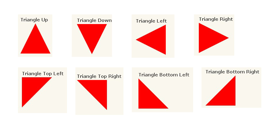
</body>三角形(各种方向三角形) 参考
1
2
3
4
5
6
7
8
9
10
11
12
13
14
15
16
17
18
19
20
21
22
23
24
25
26
27
28
29
30
31
32
33
34
35
36
37
38
39
40
41
42
43
44
45
46
47
48
49
50
51
52
53
54
55
56
57
58
59#triangle-up {
width: 0;
height: 0;
border-left: 50px solid transparent;
border-right: 50px solid transparent;
border-bottom: 100px solid red;
}
#triangle-down {
width: 0;
height: 0;
border-left: 50px solid transparent;
border-right: 50px solid transparent;
border-top: 100px solid red;
}
#triangle-left {
width: 0;
height: 0;
border-top: 50px solid transparent;
border-right: 100px solid red;
border-bottom: 50px solid transparent;
}
#triangle-right {
width: 0;
height: 0;
border-top: 50px solid transparent;
border-left: 100px solid red;
border-bottom: 50px solid transparent;
}
#triangle-topleft {
width: 0;
height: 0;
border-top: 100px solid red;
border-right: 100px solid transparent;
}
#triangle-topright {
width: 0;
height: 0;
border-top: 100px solid red;
border-left: 100px solid transparent;
}
#triangle-bottomleft {
width: 0;
height: 0;
border-bottom: 100px solid red;
border-right: 100px solid transparent;
}
#triangle-bottomright {
width: 0;
height: 0;
border-bottom: 100px solid red;
border-left: 100px solid transparent;
}
input 的 placeholder 的样式
使用伪元素 input::input-placeholder
1 | input::-webkit-input-placeholder { |
设置 hr 的样式
1 | hr { |
长度单位
像素 px
- 我们在网页中使用最多的单位, 1px 相当于屏幕中的一个点
百分比 %
根据父元素来计算
当父元素的属性值发生变化, 子元素也会跟着改变
em
相对于
当前元素的字体大小来计算, 1em = 1 个 font-size当元素的字体大小改变时, em 也会随之改变
rem
- 基于 html 字体大小 1rem = html 的字体大小
盒子模型
CSS 处理网页时, 它认为每个元素都包含在一个看不见的盒子里
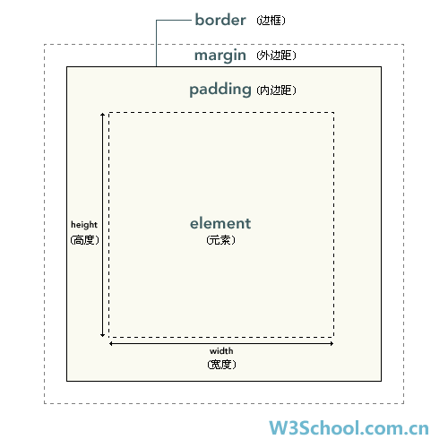
一个盒子我们分成几个部分
内容区 (content)
- 子元素默认在父元素的
内容区 - width —— 内容区的宽度
- height —— 内容区的高度
- 子元素默认在父元素的
内边距 (padding)
边框 (border)
- 外边距 (margin)
不会影响可见框大小, 只会影响盒子的位置
盒子的大小由内容区、边框 和 内边距决定
margin
盒子与其它盒子之间的距离
写法 —— margin: 上 右 下 左
margin 还可以设置成 auto, 一般只设置给水平方向的 margin;
如果
只设置给 左/右外边距中的一个, 则外边距会设置成最大;由于网页中的盒子都是靠上靠左摆放的, 所以注意,
当我们设置上、左外边距时, 会导致盒子自身的位置发生变化; 而设置右、下边距, 会导致其他盒子位置发生变化
块级元素水平居中
给块级元素设置 margin: 0 auto; 可以让其在父元素中水平居中
1 | <div class="box"> |
1 | .son { |
margin-top 重叠问题
**垂直外边距**的重叠问题
- 在网页中,
垂直方向的相邻外边距会发生垂直外边距的重叠兄弟元素之间的相邻垂直外边距会取较大值, 而不是求和父子元素之间的垂直外边距相邻了, 则子元素的外边距会设置给父元素- 解决方法1 —— 给父元素设置 border-top: 1px solid #333;
- 解决方法2 —— 给父元素设置 overflow: hidden;
内联(行内)元素的盒模型
不能设置 width、height
可以设置内边距 (padding)
可以设置 水平方向的内边距
也可以设置垂直方向的内边距, 但是不会影响网页的布局 (通常不用)
可以设置边框 (border)
水平方向的边框没有问题
垂直方向的不会影响到网页布局 (通常不用)
可以设置水平方向外边距 (margin)
不支持垂直方向的外边距
display 和 visibility
- display
- 修改元素的类型
- none —— 不显示
- 使用该方式隐藏的元素不显示在页面中, 也
不占位置
- 使用该方式隐藏的元素不显示在页面中, 也
- inline —— 将一个元素作为内联元素显示
- block —— 将一个元素作为块元素显示
- inline-block —— 将一个元素作为行内块元素显示
- ⚠️ 转为行内块的元素内容如果是纯文本且没有设置 width
- 若纯文本没有换行, 则该行内块的宽度为文本实际宽度
- 若纯文本换行了, 则该行内块的宽度为父元素宽度
- ⚠️ 转为行内块的元素内容如果是纯文本且没有设置 width
- visibility
- 元素是否可见
- visible —— 可见
- hidden —— 不可见
- 元素只是在页面中不可见, 仍然
占位置
- 元素只是在页面中不可见, 仍然
overflow
- 设置父元素如何处理溢出的内容
- visible —— 默认值, 溢出部分显示
- hidden —— 溢出部分不显示
- scroll —— 显示滚动条 (无论是否溢出)
- auto —— 溢出时才添加滚动条
浏览器默认样式
清除浏览器默认样式
1 | /* 性能不是很好, 不常用 */ |
文档流
文档流处在网页的最底层, 它表示的是一个页面中的位置
我们所创建的元素默认都处在文档流中
元素在文档流中的特点
- 块元素
- 独占一行, 默认
自上向下排列 - 块元素在文档流中
默认宽度是父元素的 100% - 块元素在文档流中
默认高度由内容决定
- 独占一行, 默认
- 内联元素
- 只占自身的大小, 默认
从左向右排列 - 内联元素的宽度和高度都由内容撑开
- 只占自身的大小, 默认
- 块元素
浮动
float 使元素浮动, 脱离文档流
- left —— 左浮动
- right —— 右浮动
浮动的特点:
浮动只会影响它
后面的元素浮动的元素不会超过它上边的兄弟元素
浮动的元素
不会盖住文字, 文字会自动环绕在浮动元素的周围- 所以, 可以通过设置浮动来做
文字环绕图片效果
- 所以, 可以通过设置浮动来做
浮动元素的默认宽高由内容撑开
高度塌陷问题
在文档流中, 父元素的高度默认由子元素撑开
当子元素浮动以后, 子元素脱离文档流, 导致父元素高度塌陷, 影响网页布局
解决方法1: 给父元素加 overflow: hidden;
解决方法2: 额外标签法 (不常用)
- 在高度塌陷的元素的最后, 添加一个空的 div 子元素, 对其加 clear: both;
解决方法3: 伪类元素 ::after (
推荐使用)1
2
3
4
5
6
7
8
9
10.clearfix::after {
content: ""; /* 添加一个行内元素 */
display: block; /* 转为块级 */
clear: both; /* 清除两侧浮动 */
}
/* 兼容 IE6 */
.clearfix {
zoom: 1;
}解决方法4: 双伪元素 (可以解决浮动引起的父元素高度塌陷问题 和 父子元素垂直外边距重叠问题)
1
2
3
4
5
6.clearfix::before,
.clearfix::after {
content: "";
display: table;
clear: both;
}
clear (只对块级元素起作用)
清除其他浮动(兄弟)元素对当前元素的影响 (位置不会顶上去)
- none: 默认值
- left —— 清除左侧浮动元素对当前元素的影响
- right —— 清除右侧浮动元素对当前元素的影响
- both —— 清除两侧浮动元素对当前元素的影响, 其实是清除影响大的
BFC(Block Formatting Context)
根据 W3C 的标准, 在页面中的元素都有一个隐含的属性, 叫 BFC (块级格式化环境)
- 该属性可以设置打开或关闭, 默认时关闭的;
当开启元素的 BFC 后, 元素将会有如下特性:
父元素的垂直外边距不会和子元素重叠
开启 BFC 的元素不会被浮动元素所覆盖 (会显示在浮动元素的同一行)
开启 BFC 的元素可以包含浮动的子元素, 高度不会塌陷
开启 BFC 的方式
- 设置元素浮动 (不好用)
- 设置元素绝对定位 (不好用)
- 设置元素为 inline-block (不好用)
- 设置元素 overflow: hidden/auto; (常用)
定位
将指定的元素摆放到页面的额任意位置
通过定位可以任意摆放元素
position (
子绝父相)- static —— 默认值, 不开启定位
- relative —— 相对定位
- 相对于元素原来在文档流中的位置进行定位
- 相对定位的元素不会脱离文档流,
不会影响网页布局 - 相对定位会使元素提高一个层级
- 相对定位*
不会改变元素的性质* (块还是块, 内联还是内联)
- absolute —— 绝对定位
- 绝对定位会使元素脱离文档流
- 偏移量是相对于离它最近的
开启了相对定位的祖先元素 - 一般开启了子元素的绝对定位, 都会开启父元素的相对定位
- 绝对定位会使元素提升一个层级
- 绝对定位会改变元素性质, 会使元素具有行内块属性
- fixed —— 固定定位
- 相对于
浏览器窗口 - 开启了固定定位的元素不会随网页滚动而滚动
- 相对于
left、top、right、bottom (开启了非 static 定位才有效)
- 偏移量
z-index (开启了非 static 定位才有效)
- 层级 (整数)
- 如果定位元素的层级是一样的, 则后面的会盖住前面的
- 父元素的层级再高, 也不会盖住子元素
- 没有定位的元素, 不能使用 z-index
opacity
透明度
- opacity: 0.5 (0-1之间的小数)
IE8 以下使用
- filter: alpha(opacity=50)
CSS背景
背景颜色
- background-color
背景图片
- background-image
- url(图片地址)
- background-image
背景图片平铺
- background-repeat
- no-repeat —— 不平铺
- repeat-x —— 水平方向平铺
- repeat-y —— 垂直方向平铺
- background-repeat
背景图片位置
- background-position
- top、left、right、bottom、center 中的两个值来指定背景图片位置
- 如果只指定了一个值, 那么第二个值默认为 center
- x px y px
- 第一个值是水平位置, 第二个值是垂直位置
- 如果只指定一个值, 第二个默认为 50%
- x% y%
- 第一个值是水平位置, 第二个值是垂直位置
- 如果只指定一个值, 第二个默认为 50%
- top、left、right、bottom、center 中的两个值来指定背景图片位置
- background-position
背景图片滚动
- background-attachment
- scroll —— 默认值
- fixed —— 背景图片固定在某一位置, 不随页面滚动
- 此时背景图片的定位永远相对于浏览器窗口
- background-attachment
背景简写
- background: #ccc url() center center no-repeat fixed;
- 没有顺序要求, 也没有数量要求, 如果不写就采用默认值
相对路径写在哪就是相对于哪个文件
背景图片切换时的闪烁问题
- 原因
- 背景图片是以外部资源的形式加载进网页的, 浏览器每加载一个外部资源就需要单独发送一次请求, 但是我们的外部资源并不是同时加载的, 浏览器会在资源被使用时采取加载资源
- 解决方法
- 精灵图 (sprite) (把多个背景图拼在一张图上, 减少请求次数, 提高访问效率, 提高用户体验)
- 再通过 background-position 设置为负值来切换显示的图片的位置
CSS Hack(不推荐)
指的是
一段特俗的代码, 只在某些浏览器下识别, 而在其他浏览器下不识别通过这种方式, 为一些浏览器设置一些特俗的代码
条件 hack
只对 ie 浏览器有效, 其他浏览器都会将它识别为注释
1
2
3
4
5
6
7
8
9<!-- 只会出现在 IE6 中 -->
<!--[if IE 6]>
<p>远离 IE6 </p>
<![endif]-->
<!-- 只会出现在 IE9 以下 -->
<!--[if lt IE 9]>
<p>IE9 以下显示 </p>
<![endif]-->
属性 hack
1
2
3
4
5
6body {
background-color: red;
_background-color: red; /* 只有 ie6 及以下可识别 */
*background-color: red; /* 只有 ie7 及以下可识别 */
background-color: red\0; /* 只有 ie8 以上可识别 */
}
命名规范
id 和 class 命名规范
- 尽量英文
- 驼峰命名法 或 _ 连接 或 -连接
解决 IE6 的 png 问题
1 | <!-- 处理ie6的png问题 --> |
IE6 双边距问题
浮动的元素设置外边距, 在 IE6 里会变线双倍边距问题
- 解决: display: inline;
默认值
- left、top、right、bottom、width、height
- 默认值为
auto
- 默认值为
- margin、padding
- 默认值为
0
- 默认值为
- border-width
- 默认值为
中等大小
- 默认值为
auto 和 100% 的区别
width:auto 包含 margin-left/margin-right 的属性值
- width:auto 总是占据整行,不会出现滚动条
width:100% 并不包含 margin-left margin-right 的属性值,直接取其父容器的宽度加上含 margin-left /margin-right的值
- width:100% 如果设置了 margin 就会出现滚动条
百分比参照谁?
width、height
- 参照父元素(包含块)的 width、height
margin、padding
- 参照父元素(包含块)的 width
三列布局
两边固定, 中间自适应
定位实现(移动端用)
浮动实现
圣杯布局
两边固定, 中间自适应
当中列要完整显示
当中列要优先加载
技术点
- 1.浮动搭建完整的布局框架
- 2.margin 为负值, 调整旁边两列的位置(使三列布局到一行上)
- 3.使用相对定位, 调整旁边两列的位置到两头
1
2
3
4
5
6
7
8
9
10
11
12
13
14
15
16
17
18
19
20
21
22
23
24
25
26
27
28
29
30
31
32
33
34
35
36
37
38
39
40
41
42
43
44
45
46
47
48
49
50
51
52
<html lang="en">
<head>
<meta charset="UTF-8">
<title>浮动</title>
<style type="text/css">
* {
margin: 0;
padding: 0;
}
body {
min-width: 600px;
}
.box {
padding: 0 100px;
}
.middle {
background-color: pink;
float: left;
width: 100%;
}
.left,
.right {
width: 100px;
background-color: hotpink;
float: left;
position: relative;
}
.left {
margin-left: -100%;
left: -100px;
}
.right {
margin-left: -100px;
right: -100px;
}
.clearfix::before,
.clearfix::after {
content: '';
display: table;
clear: both;
}
</style>
</head>
<body>
<div class="box clearfix">
<div class="middle">middle</div>
<div class="left">left</div>
<div class="right">right</div>
</div>
</body>
</html>
双飞翼布局
不用定位
与圣杯的区别
- 如何处理中间列的位置
- 圣杯用相对定位处理两侧的元素;
- 双飞翼把主列嵌套在一个父级块中
1
2
3
4
5
6
7
8
9
10
11
12
13
14
15
16
17
18
19
20
21
22
23
24
25
26
27
28
29
30
31
32
33
34
35
36
37
38
39
40
41
42
43
44
45
46
47
48
49
50
51
52
53
<html lang="en">
<head>
<meta charset="UTF-8">
<title>浮动</title>
<style type="text/css">
* {
margin: 0;
padding: 0;
}
body {
min-width: 600px;
}
.box {
}
.middle {
background-color: pink;
float: left;
width: 100%;
}
.middle .m-inner {
padding: 0 100px;
}
.left,
.right {
width: 100px;
background-color: hotpink;
float: left;
}
.left {
margin-left: -100%;
}
.right {
margin-left: -100px;
}
.clearfix::before,
.clearfix::after {
content: '';
display: table;
clear: both;
}
</style>
</head>
<body>
<div class="box clearfix">
<div class="middle">
<div class="m-inner">middle</div>
</div>
<div class="left">left</div>
<div class="right">right</div>
</div>
</body>
</html>- 如何处理中间列的位置
等高布局(伪等高)
margin 才能确定边界
核心
- padding-bottom: 10000px;
- margin-bottom: -10000px;
1
2
3
4
5
6
7
8
9
10
11
12
13
14
15
16
17
18
19
20
21
22
23
24
25
26
27
28
29
30
31
32
33
34
35
36
37
38
39
40
41
42
43
44
45
46
47
48
49
50
51
52
53
54
55
56
57
58
59
<html lang="en">
<head>
<meta charset="UTF-8">
<title>浮动</title>
<style type="text/css">
* {
margin: 0;
padding: 0;
}
.box {
width: 700px;
margin: 0 auto;
border: 1px solid #000;
overflow: hidden;
}
.box1,
.box2 {
float: left;
padding-bottom: 10000px;
margin-bottom: -10000px;
}
.box1 {
width: 200px;
background-color: pink;
}
.box2 {
width: 500px;
background-color: hotpink;
}
.clearfix::before,
.clearfix::after {
content: '';
display: table;
clear: both;
}
</style>
</head>
<body>
<div class="box clearfix">
<div class="box1">
box1<br>
box1<br>
box1<br>
box1<br>
box1<br>
box1<br>
box1<br>
box1<br>
</div>
<div class="box2">
box2<br>
box2<br>
box2<br>
box2<br>
</div>
</div>
</body>
</html>
禁止系统默认滚动条
默认的滚动条在 文档 身上, 不是 html, 也不是 body
方便自定义滚动条
1
2
3
4html, body {
height: 100%;
overflow: hidden;
}⚠️
- 浏览器默认的滚动条是
文档的, 不是 html 的, 也不是 body 的 - 如果单独给 html 或者 body 设置 overflow: scroll , 滚动条还是会加给
文档 - 只有当 html 和 body 都设置 overflow: scroll, html 的滚动条会加给文档 ; body 的滚动条会加给 body
- 浏览器默认的滚动条是
使用绝对定位模拟固定定位
1 |
|
Sticky Footer
粘连布局
我们有一块内容
当
的高度足够长的时候, 当
的高度比较小的时候, 我们希望这个 1
2
3
4
5
6
7
8
9
10
11
12
13
14
15
16
17
18
19
20
21
22
23
24
25
26
27
28
29
30
31
32
33
34
35
36
37
38
39
40
41
42
43
44
45
46
47
48
49
50
51
52
53
54
55
56
57
58
59
60
61
62
63
<html lang="en">
<head>
<meta charset="UTF-8">
<title>浮动</title>
<style type="text/css">
* {
margin: 0;
padding: 0;
}
html,
body {
height: 100%;
}
.box {
height: 100%;
}
.main {
text-align: center;
background-color: pink;
padding-bottom: 50px;
min-height: 100%;
box-sizing: border-box;
}
.footer {
height: 50px;
line-height: 50px;
text-align: center;
background-color: hotpink;
margin-top: -50px;
}
</style>
</head>
<body>
<div class="box">
<div class="main">
main<br>
main<br>
main<br>
main<br>
main<br>
main<br>
main<br>
main<br>
main<br>
main<br>
main<br>
main<br>
main<br>
main<br>
main<br>
main<br>
main<br>
main<br>
main<br>
main<br>
main<br>
main<br>
</div>
<div class="footer">footer</div>
</div>
</body>
</html>
BFC
Box Formatting Context —— 块级格式化上下文
是一个独立的渲染区域, 只有
块级元素参与, 它规定了内部的块级元素如何布局BFC 的布局规则
- 内部的 box 会在垂直方向, 一个接一个地放置
- BFC 的区域不会与 float box 重叠
- 内部的 box 垂直方向的距离由 margin 决定, 属于同一个 BFC 的相邻的两个 box 的垂直 margin 会发生重叠
- 计算 BFC 的高度时, 浮动元素也参与计算(清除浮动)
- BFC 就是页面上一个隔离的独立容器, 容器里的子元素不会影响到外面的元素
BFC 什么时候出现(开启)?
- 根元素
- float 不为 none
- position 为 absolute 或 fixed
- overflow 不为 visible
- disable 为 inline-block
BFC 实现两列布局
一列固定宽度, 另一列自适应
原理
BFC 的区域不会与 float box 重叠
1
2
3
4
5
6
7
8
9
10
11
12
13
14
15
16
17
18
19
20
21
22
23
24
25
26
27
28
29
30
31
32
33
34
35
<html lang="en">
<head>
<meta charset="UTF-8">
<title>浮动</title>
<style type="text/css">
* {
margin: 0;
padding: 0;
}
.box {
width: 600px;
height: 300px;
margin: 0 auto;
border: 1px solid #000;
}
.box1 {
width: 200px;
background-color: pink;
float: left;
}
.box2 {
background-color: hotpink;
overflow: hidden;
}
</style>
</head>
<body>
<div class="box">
<div class="box1">left</div>
<div class="box2">right</div>
</div>
</body>
</html>
检测低版本 IE 函数
1 | function isIE(n) { |
垂直水平居中
已知宽高的元素
方案一
1
2
3
4
5
6
7
8
9
10
11
12
13
14
15
16
17
18
19
20
21
22
23
24
25
26
27
28
29
30
31
<html lang="en">
<head>
<meta charset="UTF-8">
<title>Document</title>
<style type="text/css">
.box {
width: 400px;
height: 600px;
background-color: pink;
margin: 0 auto;
position: relative;
}
.box1 {
width: 100px;
height: 100px;
background-color: hotpink;
position: absolute;
left: 50%;
top: 50%;
margin-left: -50px;
margin-top: -50px;
}
</style>
</head>
<body>
<div class="box">
<div class="box1"></div>
</div>
</body>
</html>方案二
- 绝对定位盒子的特性
- 水平方向上 —— left + right + width + padding + margin = 包含块的宽度
- 垂直方向上 —— top + bottom + height + padding + margin = 包含块的高度
1
2
3
4
5
6
7
8
9
10
11
12
13
14
15
16
17
18
19
20
21
22
23
24
25
26
27
28
29
30
31
32
<html lang="en">
<head>
<meta charset="UTF-8">
<title>Document</title>
<style type="text/css">
.box {
width: 400px;
height: 600px;
background-color: pink;
margin: 0 auto;
position: relative;
}
.box1 {
width: 100px;
height: 100px;
background-color: hotpink;
position: absolute;
left: 0;
top: 0;
right: 0;
bottom: 0;
margin: auto;
}
</style>
</head>
<body>
<div class="box">
<div class="box1"></div>
</div>
</body>
</html>- 绝对定位盒子的特性
未知宽高的元素水平垂直居中
transform: translate(-50%, -50%)
1
2
3
4
5
6
7
8
9
10
11
12
13
14
15
16
17
18
19
20
21
22
23
24
25
26
27
28
29
30
31
32
<html lang="en">
<head>
<meta charset="UTF-8">
<title>Document</title>
<style type="text/css">
.box {
width: 400px;
height: 600px;
background-color: pink;
margin: 0 auto;
position: relative;
}
.box1 {
background-color: hotpink;
position: absolute;
left: 50%;
top: 50%;
transform: translate(-50%, -50%);
}
</style>
</head>
<body>
<div class="box">
<div class="box1">
skahsajsjjjslasjaljlajjlj<br>
skahsajsjjjslasjaljlajjlj<br>
skahsajsjjjslasjaljlajjlj<br>
</div>
</div>
</body>
</html>
图片水平垂直居中
- vertical-align —— 只对
行内块起作用
1
2
3
4
5
6
7
8
9
10
11
12
13
14
15
16
17
18
19
20
21
22
23
24
25
26
27
28
29
30
31
<html lang="en">
<head>
<meta charset="UTF-8">
<title>Document</title>
<style type="text/css">
.box {
width: 400px;
height: 600px;
background-color: pink;
margin: 0 auto;
text-align: center;
}
.box::after {
content: "";
display: inline-block;
height: 100%;
vertical-align: middle;
}
img {
vertical-align: middle;
}
</style>
</head>
<body>
<div class="box">
<img src="timg.jpg" width="200">
</div>
</div>
</body>
</html>- vertical-align —— 只对
省略号
单行溢出显示省略号
元素得
设置宽度1
2
3
4
5.box {
text-overflow: ellipsis;
overflow: hidden;
white-space: nowrap; /* 不换行 */
}
多行显示省略号
可以指定显示几行
1
2
3
4
5text-overflow: ellipsis;
overflow : hidden;
display: -webkit-box;
-webkit-line-clamp: 2; // 指定几行
-webkit-box-orient: vertical;cssreset
通用 css 重置文件 base.css
1 | /* reset css */ |