响应式 UI 框架
- 一套比较完整的用于前端页面构建的库
- 可以叫它
前端 UI 框架, 不能说它是前端框架 - Bootstrap 是最受欢迎的 HTML、CSS 和 JS 框架,用于开发响应式布局、移动设备优先的 WEB 项目
为什么使用它?优点?
有自己的生态圈, 不断地更新迭代
提供了一套简洁、直观、强悍的组件
标准化的 html + css 编码规范
让开发更简单, 提高了开发效率 (只要加几个类就可以实现效果)
可扩展, 可自定义样式或修改默认样式
normalize.css 和 cssret.css 的区别?
- 共同点
- 都是重置样式库, 增强浏览器表现的一致性
- 不同点
- normalize.css 不会重置本身已经在每个浏览器表现一致的元素
- eg. ul 在每个浏览器中都默认有黑点, 不会被重置
- reset.css 可以根据需求去设置严肃的样式
- 可以根据需求设置 ul 的 list-style: none;
- normalize.css 不会重置本身已经在每个浏览器表现一致的元素
bootstrap.css 默认已经引用了 normalize.css, 不需要我们再额外引入
bootstrap 的使用
官方推荐在基本模版上进行修改
1 | <!-- 基本模版 --> |
- 实例模版
- 我们一般可以直接下载实例进行修改
- 方式一
- 打开选好的例子 —— 右键查看源代码 —— 保存
- 方式二
- Get the source code for every example below by downloading the Bootstrap repository. Examples can be found in the
docs/examples/directory.
- Get the source code for every example below by downloading the Bootstrap repository. Examples can be found in the
- 方式一
- 我们一般可以直接下载实例进行修改
容器
Bootstrap 需要为页面内容和栅格系统包裹一个 .container 容器
- 我们提供了两个作此用处的类
.container和.container-fluid- 注意,由于 padding 等属性的原因,这两种容器类不能互相嵌套
固定容器
.container 类用于固定宽度并支持响应式布局的容器
- .container 容器左右默认有 15px 的 padding
- 宽度 1170px / 970px / 750px / auto (由
阈值决定)
1 | <div class="container"> |
- 阈值
- 小于 768px —— xs - 手机
- 大于等于 768px —— sm - 平板
- 大于等于 992px —— md - 中屏 PC
- 大于等于 1200px —— lg - 大屏 PC
流体容器
.container-fluid 类用于 100% 宽度,占据全部视口(viewport)的容器
- 宽度 100%
1 | <div class="container-fluid"> |
栅格系统
Bootstrap 提供了一套响应式、移动设备优先的 流式栅格系统,随着屏幕或视口(viewport)尺寸的增加,系统会自动分为最多12列。它包含了易于使用的预定义类,还有强大的mixin 用于生成更具语义的布局。
- bootstrap 通过一系列的行(row)与列(column)的组合来创建页面布局, 网页内容就可以放入这些创建好的布局中 —— 其实就是行和列布局
- 默认一行分 12 列
- container 容器默认有 15px 的 padding (水平方向)
- row 容器默认有 -15px 的 margin (水平方向)
- col 容器默认有 15px 的 padding (水平方向)
- @grid-gutter-width
- 槽宽默认是 30px
Bootstrap 栅格系统的工作原理
“行(row)”必须包含在
.container(固定宽度)或.container-fluid(100% 宽度)中;.row 默认有 -15px 的左右 margin (填充了 .container 左右的 15px 的 padding)
通过“行(row)”在水平方向创建一组“列(column)”
内容应当放置于“列(column)”内,并且,只有“列(column)”可以作为行(row)”的直接子元素;
.col 默认有 15px 的左右 padding
.col-*-*
第一个 * : 设备种类 (lg、md、sm、xs)
- lg —— 大屏设备及以上生效
- md —— 中屏设备及以上生效
- sm —— 小屏设备及以上生效
- xs —— 超小屏设备及以上生效
第二个 * : 占 12 的几份
2
3
<div class="col-sm-4"></div>
<div class="col-sm-4"></div> <!-- 在小屏及以上设备都生效, 都是均分 3 份 -->类似
.row和.col-xs-4这种预定义的类,可以用来快速创建栅格布局通过为“列(column)”设置
padding属性,从而创建列与列之间的间隔(gutter)。通过为.row元素设置负值margin从而抵消掉为.container元素设置的padding,也就间接为“行(row)”所包含的“列(column)”抵消掉了padding。栅格系统中的列是通过指定1到12的值来表示其跨越的范围。例如,三个等宽的列可以使用三个
.col-xs-4来创建如果一“行(row)”中包含了的“列(column)”大于 12,多余的“列(column)”所在的元素将被作为一个整体另起一行排列
col 里面可以嵌套 row
栅格系统基本使用
1 | <!-- |
行 & 列
- 行
- 默认样式
- margin-left: -15px
- margin-right: -15px
- 默认样式
- 列
- 默认样式
- position: relative
- min-height: 1px
- padding-left: -15px
- padding-right: -15px
- 默认样式
列嵌套
可以在 col 里前套 row
1 | <div class="row"> |
列偏移(.col-md-offset-3)
使用 .col-md-offset-* 类可以将列向右侧偏移。这些类实际是通过使用 * 选择器为当前元素增加了左侧的边距(margin)。例如,.col-md-offset-4 类将 .col-md-4 元素向右侧偏移了 4 个列(column)的宽度
最终的实现相当于
margin-left1
2
3
4
5
6
7
8
9
10
11<div class="row">
<div class="col-md-4">.col-md-4</div>
<div class="col-md-4 col-md-offset-4">.col-md-4 .col-md-offset-4</div>
</div>
<div class="row">
<div class="col-md-3 col-md-offset-3">.col-md-3 .col-md-offset-3</div>
<div class="col-md-3 col-md-offset-3">.col-md-3 .col-md-offset-3</div>
</div>
<div class="row">
<div class="col-md-6 col-md-offset-3">.col-md-6 .col-md-offset-3</div>
</div>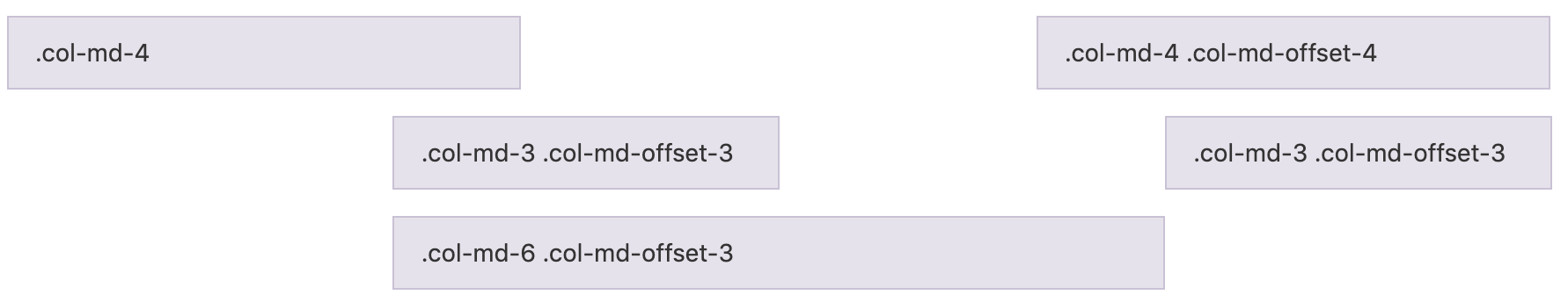
列排序(.col-md-push/pull-3)
通过使用 .col-md-push-* 和 .col-md-pull-* 类就可以很容易的改变列(column)的顺序
最终的实现相当于
定位push —— 往后推 pull —— 往前拉
1
2
3
4<div class="row">
<div class="col-md-9 col-md-push-3">.col-md-9 .col-md-push-3</div>
<div class="col-md-3 col-md-pull-9">.col-md-3 .col-md-pull-9</div>
</div>
栅格盒模型
- 容器两边有 15px 的 padding
- 为了让容器可以包裹住行
- 行两边有 -15px 的 margin
- 为了能使列嵌套行
- 列两边有 15px 的 padding
- 为了维护槽宽的规则
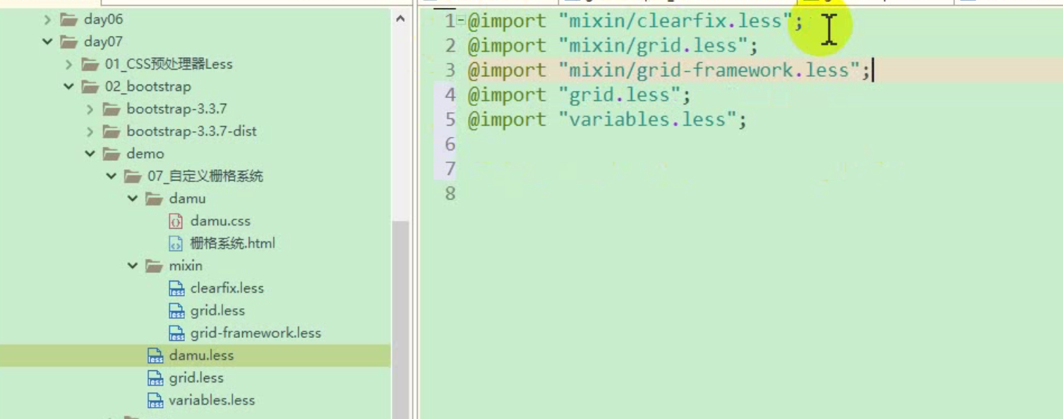
自定义栅格系统
拷贝 bootstrap dist 目录中跟栅格有关的 less 文件
mixin/clearfix.less mixin/grid.less mixin/grid-framework.less grid.less variables.less把
mixin/grid-framework.less中的col-换成damu-col-新建自己的
damu.less在
damu.less中引入相关文件⚠️ 先引入混入
编译
damu.less生成damu.css文件即可直接使用
damu.css文件
响应式工具
为了加快对移动设备友好的页面开发工作,利用媒体查询功能并使用这些工具类可以方便的 针对不同设备展示或隐藏页面内容
有针对性的使用这类工具类,从而避免为同一个网站创建完全不同的版本
可用的类
- .visible-xs-*
*的取值可能是 inline、inline-block、block, 每个针对 CSS 中不同的display属性
- .hidden-xs-*
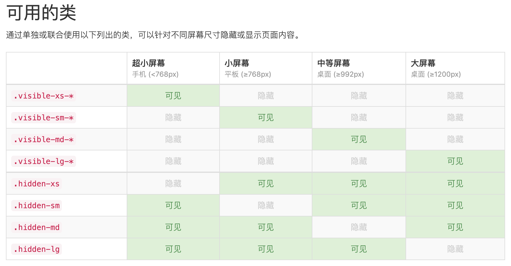
- .visible-xs-*
Bootstrap 常用类
- 浮动相关
- pull-left
- pull-right
- 文本对齐
- text-left
- text-right
- text-center
- 显示隐藏
- hidden-xs/sm/md/lg
Bootstrap 常用组件
-
- 由 html + css 组成的特定结构和样式的静态结构
- js 插件
- 怎么在组件中使用 js 功能
- 就是
有交互功能的组件 - 建议使用压缩版的 js 文件
bootstrap.js和bootstrap.min.js都包含了所有插件,你在使用时,只需选择一个引入页面就可以了
无数可复用的组件,包括字体图标、下拉菜单、导航、警告框、弹出框等更多功能
按钮(组)、导航、下拉菜单、分页、弹出框、标签、徽章、巨幕、进度条、警告框、面板…ect
导航条和 collapsed 组件
1
2
3
4
5
6
7
8
9
10
11
12
13
14
15
16
17
18
19
20
21
22
23
24
25
26
27
28
29
30
31
32
33
34
35
36
37
38
39
40
41
42
43
44
45
46
47
48
49
50
51
52
53
54
55
56
57
58
59
60
61<!--
类名 collapsed 折叠样式
属性 data-toggle="collapse" 声明是折叠组件
data-target=".box" 声明控制的目标元素
其他
aria-expanded="false" 提供给屏幕阅读器使用的(特俗人群使用)
class="sr-only" 也是给屏幕阅读器使用的
-->
<nav class="navbar navbar-default">
<div class="container">
<!-- Brand and toggle get grouped for better mobile display -->
<div class="navbar-header">
<button type="button" class="navbar-toggle collapsed" data-toggle="collapse" data-target="#bs-example-navbar-collapse-1" aria-expanded="false">
<span class="sr-only">Toggle navigation</span>
<span class="icon-bar"></span>
<span class="icon-bar"></span>
<span class="icon-bar"></span>
</button>
<a class="navbar-brand" href="#">Brand</a>
</div>
<!-- Collect the nav links, forms, and other content for toggling -->
<div class="collapse navbar-collapse" id="bs-example-navbar-collapse-1">
<ul class="nav navbar-nav">
<li class="active"><a href="#">Link <span class="sr-only">(current)</span></a></li>
<li><a href="#">Link</a></li>
<li class="dropdown">
<a href="#" class="dropdown-toggle" data-toggle="dropdown" role="button" aria-haspopup="true" aria-expanded="false">Dropdown <span class="caret"></span></a>
<ul class="dropdown-menu">
<li><a href="#">Action</a></li>
<li><a href="#">Another action</a></li>
<li><a href="#">Something else here</a></li>
<li role="separator" class="divider"></li>
<li><a href="#">Separated link</a></li>
<li role="separator" class="divider"></li>
<li><a href="#">One more separated link</a></li>
</ul>
</li>
</ul>
<form class="navbar-form navbar-left">
<div class="form-group">
<input type="text" class="form-control" placeholder="Search">
</div>
<button type="submit" class="btn btn-default">Submit</button>
</form>
<ul class="nav navbar-nav navbar-right">
<li><a href="#">Link</a></li>
<li class="dropdown">
<a href="#" class="dropdown-toggle" data-toggle="dropdown" role="button" aria-haspopup="true" aria-expanded="false">Dropdown <span class="caret"></span></a>
<ul class="dropdown-menu">
<li><a href="#">Action</a></li>
<li><a href="#">Another action</a></li>
<li><a href="#">Something else here</a></li>
<li role="separator" class="divider"></li>
<li><a href="#">Separated link</a></li>
</ul>
</li>
</ul>
</div><!-- /.navbar-collapse -->
</div><!-- /.container-fluid -->
</nav>-
1
2
3
4
5
6
7
8
9
10
11
12<!--
属性 data-toggle="collapse" 声明是折叠组件
data-target=".box" 声明控制的目标元素
-->
<button data-toggle="collapse" data-target=".box">menu</button>
<!-- 如果是 a 标签, 控制的目标元素可以写在 href 里 -->
<a data-toggle="collapse" href=".box">menu</a>
<div class="box">
内容<br>
内容<br>
内容<br>
</div> -
1
2
3
4
5
6
7
8
9
10
11
12
13
14
15
16
17
18
19
20
21
22
23
24
25
26
27
28
29
30
31
32
33
34
35
36
37<!--
slide 是否加上滑动效果
data-ride="carousel" 初始化轮播图
-->
<div id="carousel-example-generic" class="carousel slide" data-ride="carousel">
<!-- Indicators -->
<ol class="carousel-indicators">
<li data-target="#carousel-example-generic" data-slide-to="0" class="active"></li>
<li data-target="#carousel-example-generic" data-slide-to="1"></li>
<li data-target="#carousel-example-generic" data-slide-to="2"></li>
</ol>
<!-- Wrapper for slides -->
<div class="carousel-inner" role="listbox">
<div class="item active">
<img src="..." alt="...">
<div class="carousel-caption">
...
</div>
</div>
<div class="item">
<img src="..." alt="...">
<div class="carousel-caption">
...
</div>
</div>
...
</div>
<!-- Controls -->
<a class="left carousel-control" href="#carousel-example-generic" role="button" data-slide="prev">
<span class="glyphicon glyphicon-chevron-left" aria-hidden="true"></span>
</a>
<a class="right carousel-control" href="#carousel-example-generic" role="button" data-slide="next">
<span class="glyphicon glyphicon-chevron-right" aria-hidden="true"></span>
</a>
</div> -
1
2
3
4
5
6
7
8
9
10<!--
距离顶部 60 的时候导航条固定在顶部, 或距离底部距离 200 的时候固定在顶部
data-offset-top="60"
data-offset-bottom="200"
这 2 个写一个就可以
如果该组件初始位置不在顶部, 还应该在 css 里加上 top: 0;
-->
<div data-spy="affix" data-offset-top="60" data-offset-bottom="200">
...
</div>
覆盖 bootstrap.css 原有样式
- 如果不确定能否盖过其优先级, 可以拷贝源码的相关区块的整片代码到自己的样式文件中, 再修改成想要的样式
- 如果想要针对功能覆盖(不影响本页面其他同组件样式)
- 可以更改拷贝过来的模块名 (eg: .navbar-default => .wjs_nav)
- 缺点
- 会出现代码冗余
- 如果 bootstrap 不能满足我们的需求, 需要自己使用媒体查询来设置宽度
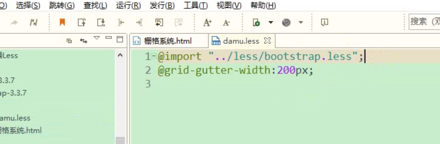
Bootstrap 定制
线下定制
- 下载 bootstrap 源文件, 打开其
less 文件夹进行修改- 新建自己的
damu.less - 引入
bootsratp.less - 重新声明自己想要的变量
- 编译
damu.less - 项目中引入
damu.css即可
- 新建自己的
- 下载 bootstrap 源文件, 打开其
应用 bootstrap 步骤
- 起步 —— 基本模版 —— 拷贝并粘贴到自己的 html 中
- 找相似组件 —— 拷贝 —— 修改